
A funny example of Apple's recent lapses in craftsmanship
Matt Jacobson
I followed some GitHub link on my iPhone today, and I saw this:
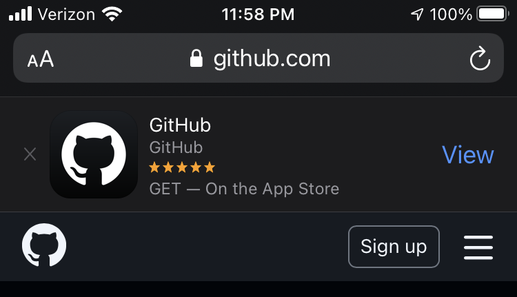
Here, Safari has prepended the normal web page with an App Store banner asking me to download the GitHub iPhone app. These banners are a familiar sight to anyone who uses iPhone Safari to browse web sites of large companies. Without commenting on whether these banners are a good idea to begin with, I'd like to focus specifically on the line:
This line interests me not just because it is weird, but also because I'm pretty sure I know exactly how it came to be.
When the App Store launched, Apple decided to label the purchase-this-app button simply with the asking price (instead of something more vague like "BUY NOW"). This ensured there was no uncertainty over how much money the user would be charged.
For a free app, the button was simply labeled: "FREE".

At some point—according to this article, sometime in November 2014—Apple changed the labels for free apps. The article suggests the reason for the change was an increase in in-app purchases (IAP) in nominally free apps; I suspect another motivation was the implicit assocation of cheapness with the word free in the App Store and indeed in greater society.
Whatever the reason, though, the buttons were changed from "FREE" to "GET".

Meanwhile, some other people were hard at work on code in Safari to show App Store banners on web sites whose metadata indicated an associated iPhone application. The banners displayed the name of the application, the name of its author, and, as relevant here, its price, formatted like this:
$PRICE_STRING — On the App Store
For a paid application, this worked out to, for example, "$2.99 — On the App Store". For a free app: "FREE — On the App Store".
This is good. Both cases parse quite naturally. These phrases are serving two purposes: they tell the reader how much the product costs and where they can find it. It's natural to have a pause between these two facts for emphasis, and the em dash before "On" provides that pause.
In a happy coincidence, the $PRICE_STRING variable always works out to be the same string as the title of the buttons in the App Store app itself.
Anyway, as mentioned earlier, at some point, the button label for free apps was changed to "GET". I was in no way involved in this decision, but I can tell you a few things with near certainty from experience in similar changes.
These sorts of changes are typically handed from a "design" team (not necessarily actual designers: I'm referring to various combinations of marketing, HI, developer relations, legal, executives, and others) to engineering. The designers have likely already undergone significant discussion among themselves, especially in such a visible change as this one. But there usually isn't much opportunity for engineering to communicate back to the designers, whether it's feedback or simply clarification. The designers' time is usually in insanely high demand—and, in any case, didn't you hear that they'd already discussed it at length? And gotten sign-offs from all the requisite stakeholders? And can it please be in the build by tomorrow?
You can certainly suss out the punchline from here. The buttons were changed from "FREE" to "GET", and the simplest, or most logical, or perhaps only way to do that was to change $PRICE_STRING to "GET". And that had the downstream effect of changing the Safari banners to read:
GET — On the App Store
This, of course, is not quite the end of the world. It still conveys something. It certainly doesn't cause high-profile apps to crash, or delete data, or fail in any sort of way that requires imminent fixing.
But let's be clear: it is definitely wrong. For one thing, unless you know this backstory, that line now only conveys one thing: that the application can be gotten on the App Store. It no longer conveys that the app is initially free, a fact I'd argue is still pertinent even in the age of IAP.[1][2]
More troublingly, however, since the change simply replaced "FREE" with "GET", the remaining sentence mechanics were left untouched. Including the em dash, for example. "GET — On the App Store", the banner now says, as if there were some other place to get iPhone apps, or as if you can do anything on the App Store but get apps.[3]
The change also leaves "GET" in capital letters — appropriate typesetting for the title of the action button in the App Store app itself, but out of place in an otherwise title-case sentence. An all-caps "FREE" carries implicit meaning — something to the effect of: free, and won't you please come take it? — but an all-caps "GET" has no such significance. Once again, I submit that it was a happy accident that the all-caps "FREE" in the App Store button matched up with the all-caps-with-implicit-meaning "FREE" in the banner.
When I'm thinking about this banner, I am swiftly and painfully transported into the mind of the engineer assigned this change. "When you say, 'change the price to "GET",' do you mean {the literal string 'GET'} or {the word 'get', capitalization-adapted to UI context}?" "How should we handle other places where prices are displayed?" "Are you even aware of such-and-such view, which would also be affected?"
Apple's engineering process effectively disincentivizes being the kind of person who asks these kinds of questions. Or, at least, it certainly doesn't directly incentivize them. A person who consistently pays attention to details like these might find themselves promoted (and handed more responsibilities) in nine months. In the short term, however, they're just making stress for themselves—and possibly enemies of their colleagues and managers in the process.
So it goes, and we end up with "GET — On the App Store".
These sorts of bugs often linger for years, ultimately to be "fixed" only by a rewrite or feature removal. Neither the designers nor the engineers have time to document their decision-making, and anyway both teams have high enough turnover that the original implementers might not be available to fill in the blanks. So future maintainers can only assume that "GET — On the App Store" was a fully thought-out decision, and attempts to fix it now carry the burden of proof that it wasn't. (As of this writing, it appears no one has borne that burden.)
This is a pretty simple example of this class of bug. There are many others, including plenty I was directly involved with. I chose to write about this one because it's easy to see, and it's easy to explain without technical details.
This bug didn't kill anyone, or launch a nuke, or violate someone's privacy. It can seem kind of rich to complain about this sort of thing.
But as a programmer, I want to operate in an environment that pays attention to these sorts of bugs, not one whose very m.o. creates them. And as a person, I want to live in a world where the tools I use every day are designed with a level of scrutiny that cares about these sorts of bugs. Right now, the market for such tools seems up for grabs again.
-
Arguably, the word "GET" suffers the same problem in the App Store itself. There, however, "GET" has added meaning simply by contrast with other apps' buttons that have numeric prices. ↩︎
-
The GitHub app, for example, is perfectly usable without its sole IAP, a subscription to GitHub Pro. ↩︎
-
Perhaps a mere matter of taste, but I also think that, even without the dash, "Get on the App Store" sounds wrong, in a way that "Free on the App Store" and "$2.99 on the App Store" don't. "Get in the App Store" might be better, but it still makes me feel weird. ↩︎